

Combat Commander Vietnam – Behind the Scenes with Counter Art
By Euan Dewhurst
When I first started drawing for Combat Commander: Vietnam, I knew almost nothing about the Vietnam War. I’d seen Apocalypse Now and First Blood, and knew its mythos in American culture, but not much more. It’s not a topic that naturally draws me in – I’m much more interested in working class history and protest movements, so to me the Vietnam War was originally interesting only for the radical movements it bred back in the United States. I was lured into learning more about the war in Vietnam itself when I realised they had dog teams and Stephen sent me a ‘dog book’. The dog book is A Soldier’s Best Friend: Scout Dogs and Their Handlers in the Vietnam War, and apart from an opening anecdote, the first third of the book relates the author’s experiences as a regular infantryman, who signed up not even knowing there was a war happening in Vietnam (or where Vietnam was on the map). I’ve found my dog book captivating, and it’s definitely increased my interest in trying to portray the ordinary people on both sides of this war, who through various circumstances found themselves fighting one another. As a history student, I used to scour Bede’s Ecclesiastical History for the glimpses of life on the ground for the ‘nobodies’ of history; the 99% of people not in the text. There’s a section in, I think, one of Gregory of Nazianus’ Orations about people buying bread at a market arguing about theology, and it gives this sudden window into the lives of ordinary people wrapped up in the politics of the world they live in. I suddenly realised that the Vietnam War had all these sources from the people themselves – from guys history wasn’t normally written about, who were writing for themselves. I still don’t care about the justifications of states and their top brass for wars, but I’m very interested in the human (and inhuman) experiences at the other end. After A Soldier’s Best Friend, I read Dang Thuy Tram’s diary of life as a North Vietnamese field doctor, Last Night I Dreamed of Peace, and I have Duong Thu Huong’s Novel Without a Name lined up to go next. I’ve also watched Ken Burns’ Vietnam documentary, and just about every film on the Vietnam War I could get my hands on, from Platoon to Birdy, Full Metal Jacket to Boat People.
When I first started drawing US soldiers from photographs, I had no idea what all the crap on their army belts was. It turns out it’s quite hard to draw amorphous blobs of containers without understanding what they are. Now I know what all the standard issue equipment is, and where each item goes on your belt, which pouch has grenades on either side, what the water canteen looks like, and the ways you can rest your rifle on it if you push it out with the side of your arm. Drawing lots of people from one period of history is an oddly intimate experience, where you learn about the weight and ease of carrying items, what’s bulky and casts shadows, and what’s too hot to walk in and can get tossed (a lot of things, it turns out).
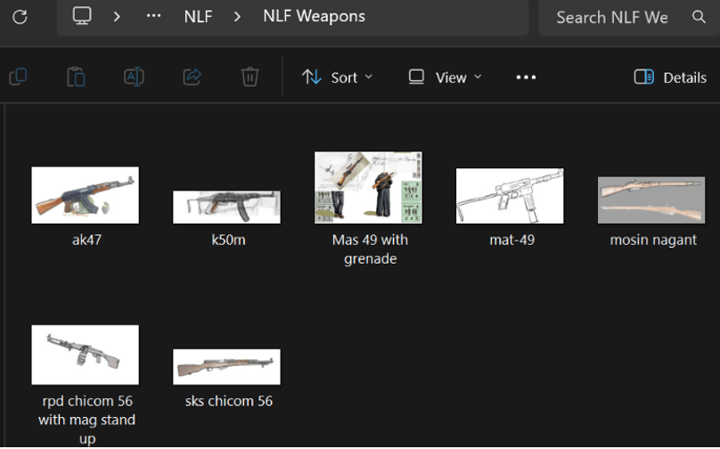
I’ve had to learn what different weapons were used and what they looked like – something I had not the slightest bit of interest in before. The first full squad I drew was for the United States, so I learned that M16s are pretty easy to draw, but M79 grenade launchers never look the right size and are fiddly. The first time I drew an M79, I drew it upside down because I thought the sights on it was a little bipod you could flip down. I’m happy to inform you that on all your counters the M79s will be the right way up, but I’m still not happy about the quantity of these I have to draw. I’ve moved a long way from this now, and can frequently be found browsing original French MAS 49 manuals or watching detailed videos on the difference between the Chicom 56 RPD or the 56-1. I doubt you’ll see the detail on a counter-size image, but I want to depict a plausible variant of the weapon in question for the sake of historical accuracy.
In an era when it’s becoming progressively harder for artists, and especially digital artists, to get work, I’m very grateful for the opportunity to work on such an exciting project. Increasingly, I think many people take art for granted, since it can be ‘generated’ with programs that scrape the hard work of many artists and Frankenstein’s-monster them together into something like a single piece. I’d like to take this opportunity to share a little of my process in making these counters, which hopefully will show the human decisions in the details, and the amazing amount of research the designers and developers have done in instructing me, to give you a cast of representative, historically informed figures for your counters.
Choosing References
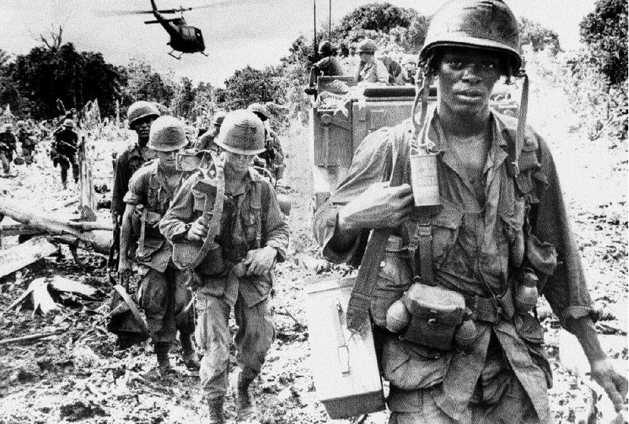
The first step in creating the counter art is looking at historical reference pictures. Stephen gave me files full of references, photos, and technical drawings, all subdivided into different factions from the game. These gave me a good profile of who was in these factions, as well as what they’re wearing and what equipment they were using. One of the photographs that caught my eye is a bedraggled group of US soldiers, heavily laden, with a jeep on one side of the image and helicopter on the other. In the foreground is a young African American man looking straight at the camera, with this tired and quite poignant expression. He looks quite thin, helmet straps dangling undone, and his uniform almost looks too big for him – hard to tell because it’s so hot that he’s wearing it in the most comfortable and loose way he can, while carrying so much gear that an artist has quite a bit of trouble distinguishing one thing from another. I decided I wanted to draw someone inspired by this man –someone who looks like he doesn’t really want to be here, but now that he is, he’s stuck in the middle of things.
For all my non-period references, I use reference photos from an open source photography collection called Unsplash. You can see a cropped headshot on the left of the sketch below (photograph by Mubarak Showole), that I’ve used as a face reference.
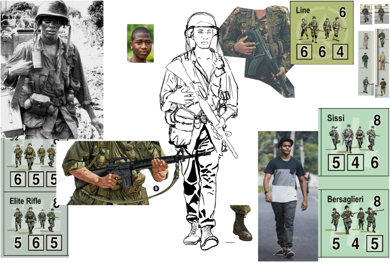
The next reference I needed was a full body pose. For Combat Commander counters, figures need to be (on the whole) walking towards the camera. In the picture above, you can see the walking pose I selected by photographer Vinayak Chowdhary in the lower right. I wanted quite a casual pose like those in the previous counters, and, when looking for reference photos of soldiers, most of the poses were too stiff to use. The figures for the counters also need to be armed, however, so I have a cropped photo in the top right by photographer Mehedi Hasan to use as a reference for this. Of course, this is only useful as a pose for the hands and the rough angle of the gun, so (after checking with Joe and Stephen) I returned to the reference collection to give my soldier an M-16 rifle. I have a reference drawing from Stephen (I believe from an Osprey book on Vietnam) that provided me with most of the technical specifications of the rifle. Then it’s a case of copying this, rotating the linework into the place of the previous gun I’d outlined, and erasing lines until there’s a more natural pose involved.
Now I can actually get to compositing most of the sketch. I want lots of the baggage and details from my original photo – I like how heavily laden he looks, the quantity of grenades on him, and how loose his shirt is. After laboriously sketching all of these, I realise the bulkiness of the gear is obscuring the cleanness of the silhouette, and I’m informed anyway that we want the bulky ammo case for the weapons team M60 assistant. So, I’m sure much to the relief of my soldier, I unburden him of some of his load. At this point, I realised my soldier still has rather fetching plimsolls from my reference photo, so I return to my references to check the standard footgear, and to grab a reference image from another technical drawing and give the soldier some more appropriate boots.
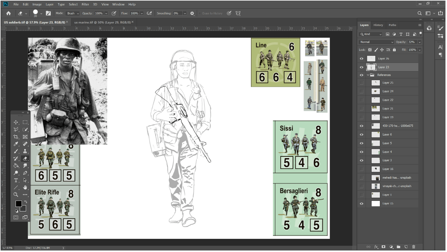
Still in his plimsolls as I composite a more appropriate gun into his hands
You might think I’m nearly done now, but actually, everything I’ve talked about so far won’t make it onto the counter. Because this is a composite sketch, it’s very messy and full of my ‘workings out’. All of the linework will be redrawn, giving it a smooth flow where weighting can be given meaningfully to lines, and not just present because I redrew a grenade three times and the last one looked almost right.
Matching style
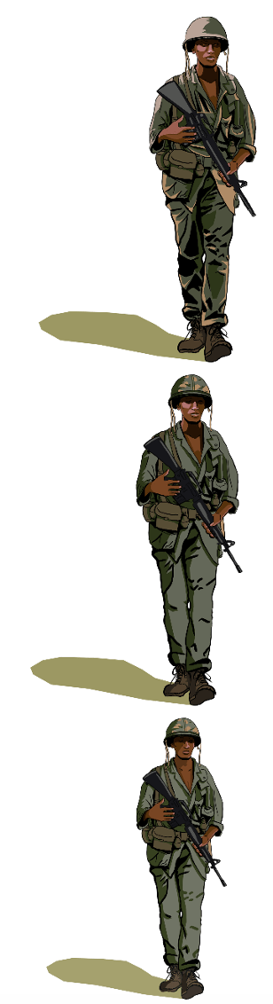
The astute among you will notice the nice borders decorating my scribbly sketch – the old Combat Commander counters all around the edges of the page. I kept these here while working on all the early sketches I made, so that I could keep comparing style and making adjustments. One of the main things I actually wanted my walking pose photo for is to get a nice reference for the big blocky shadows that dominate the art style of the original counters. The counters are about the size of my thumbnail, so a big part of their legibility needs to be in striking shadows and block colour.
As well as shadows, there’s a sketchiness to the outline of these soldiers – one of the things that first drew me to wanting to try my hand at Lee Brimmicombe-Wood’s original style. I really love the gentleness in the way movement and shape is conveyed. There’s something very casual and human in the figures, like you’ve just happened to see them going about their day. My aim in this artwork is not to create a carbon-copy of Brimmicombe-Wood’s style, but to pay homage to it in a way that fans of the game feel they can recognise. Hopefully you will recognise the deep shadows, sketchy lines, block colour, and the universal little green shadows in the work I am doing.
Over the course of drawing several figures, the style has been refined with feedback from the design team – going from simple to detailed, and back to a happy medium that preserves the simpler shapes for small printing, while also giving enough detail for larger versions of the image to have visual interest. You can see some of the style changes on the right here. The last image is the chosen style, also featuring a lighter green uniform to preserve detail at counter size.
Colouring
One of the things that I’m happily in agreement with the design team about is in the importance of giving an accurate cross-section of the different kinds of people who would have been seen in different units in the Vietnam War. The main draw of this project for me was getting to study people from so many different countries, and to try and give them a little life and character so that they can populate this game as they would have on the battlefield in real life. I have a wide variety of reference photos I’m using for features and skin tones from different ethnicities, and I am blessed to know artists from relevant demographics who’ve been looking over and colour-correcting some of my work for me (thank you, Lunch and Lex, if you read this)!
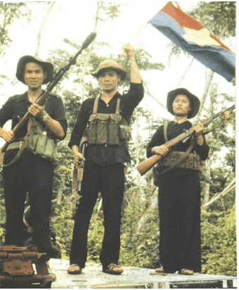
I am colour-picking skin tones from photographs for all the figures I’m drawing in Combat Commander: Vietnam. This means I’ll be able to show a range of different colours, both from natural changes in skin hues and pigmentation, and under different lighting too. Lots of the older Vietnam War-era photographs are either in black and white, or aged and saturated in ways that don’t make them great to colour-pick from. In the NLF photograph above that I used as a reference for two figures, for example, we have great full body shots, but the washed out, over-saturated colour of the whole photograph means I can’t use it for colour-picking.

For skin tone references, I instead looked for modern-day Vietnamese models to help me out. The photograph I’ve chosen here is a self-portrait of photographer Oanh MJ with her grandmother, which gave me neutral lighting to colour pick from.
In the sketch below, you can see the photograph I’ve used on the right for facial shape, and the photograph on the left for colour picking, since the original photo was too much in shadow to be of use (photographs by Quỳnh Lê Mạnh).
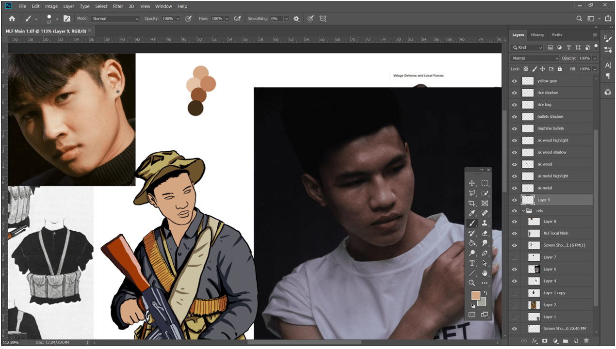

As of writing this, I have nearly completed my first two factions (US and NLF). It has been fun selecting poses that give a nice composition on a counter for a specific squad, while also giving the design and development team lots of options for mixing and matching soldiers for different squads and green teams. I’ll be moving on to NVA next, and the design team will be sharing more previews of the counter art in the near future.
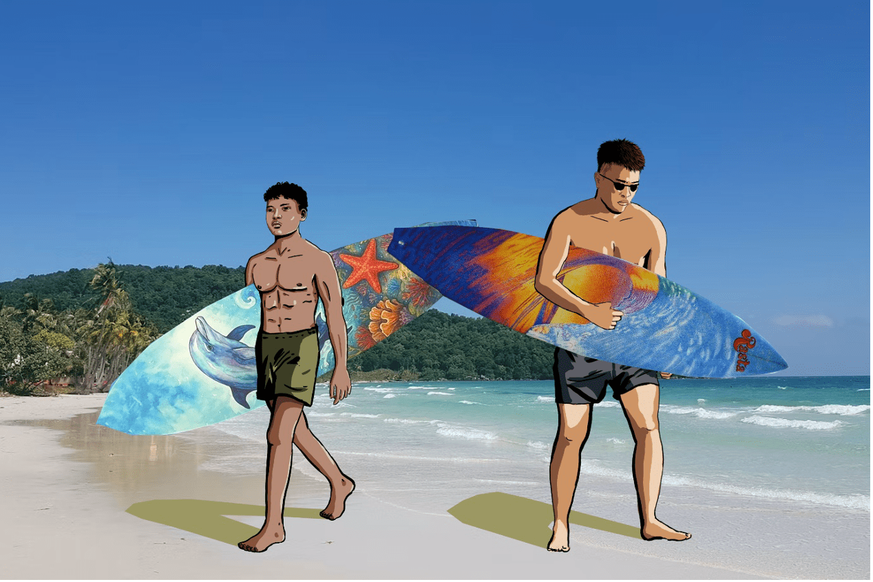
Charlie does surf: an example of what the NLF sappers won’t look like